
In conversation with Andreas Uebele
A major presence in contemporary German graphic design, Andreas Uebele’s work is a barometer of expressive and experimental graphic design. Ahead of the release of his new monograph, andreas uebele material [Unit 32], we spoke with the designer about what's on his shelves and how an architect becomes a graphic designer. We know you began your career in architecture, what attracted you to graphic design?AU: It happened by coincidence at the age of seventeen, when writing hopeful love letters it became clear to me that I got better results when they were well designed. I designed the envelopes and realised that design is something that suits me. Wayfinding and environmental typography occupy a large space in büro ueble’s portfolio, does...

Adventures in Typography with Tony Brook & Claudia Klat
What is SPIN/Adventures in Typography? How did it come about? Tony Brook: It was an itch that needed to be scratched. We’d been making a lot of experimental work, that wasn't necessarily featuring in commercial projects, but still wanted to explore further. I wanted to carry on the conversation from the Spin 360° monograph – to carry on exploring creative possibilities for type, and there wasn't really a place in the book for that. Spin 360° was never meant to be an end, but more a conversation starter. So this is just the next stage of it. Why the journal format? Tony Brook: It’s just practical. It's not too expensive. It encourages us to keep on pushing and trying things. It's...
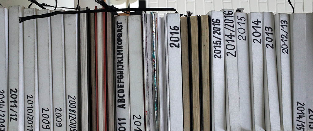
What's in Andreas Uebele's sketchbook?
What’s in Andreas Uebele’s sketchbook?From the graphics for the Reichstag to the signage for the Adidas headquarters, Andreas Uebele’s experimental work is a benchmark for expressive and ground breaking graphic design. A major presence in contemporary German graphic design, Uebele originally trained as an architect, a visible influence on much of his work today.Here we reveal a glimpse of those sparks that kindle his creative process, our favourite pages from his sketchbooks, where we investigate what informs his radical typography and bold environmental graphics: Previously featured in Unit Editions books, we’re delighted to publish his latest book andreas uebele material monograph volume 3 [Unit 32]. Sign up to our newsletter for more details!
Open Call: SPIN/Adventures in Typography Tumblr
Everyone has a file somewhere of the stuff that didn’t make the final cut. We’ve set up a Tumblr to continue the conversation started with SPIN/Adventures in Typography; a space dedicated to the material that usually remains unseen, and experimental type that hasn’t found a home yet. If you feel like sharing your specimens, send them to adventures@uniteditions.com, we’ll curate and post them on the SPIN/Adventures in Typography Tumblr, and tell everyone about them on various digital soapboxes. You can send as many specimens as you like. We need the following details: Project name Project date Designer(s) Studio Brief project description (50 words max) We look forward to seeing your creative experiments, riffs, and remixes! SPIN/Adventures in Typography [Unit 31]
A new book from leading German graphic designer Andreas Uebele
Andreas Uebele is a major presence in contemporary German graphic design. He trained as an architect, and much of his work as a graphic designer is architecture related. His environmental graphics, and radical typography, have been featured in previous Unit Editions books, and now we’re delighted to publish his latest book. Whether hanging Goethe’s words on the streets of Hanoi or visually translating the word schmuck, the work of Andreas Uebele and his studio Buro Uebele is a bench mark for expressive and ground breaking graphic design. Coming soon: andreas uebele material [Unit 32]Watch this space for more details!

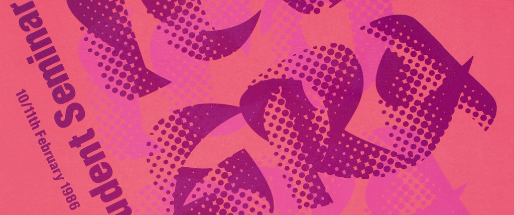
SPIN/Adventures in Typography (Issue 001)
‘Experimenting with letterforms is a natural part of making, often born out of enthusiasm rather than commercial or practical imperatives’Tony BrookSPIN/Adventures in Typography looks at the typographic flotsam and jetsam of Spin’s creative process. It’s a repository for trains of thought, itches that needed to be scratched, as well as fresh new ideas. It continues the conversation started with the studio’s 2015 monograph SPIN 360° [Unit 19].SPIN/Adventures in Typography is a visual record of Spin's creative interests and outputs – combustive explorations not afraid to plunge into the abstract, teetering on the edge of legibility. A journal boisterous with typographic riffs, remixes, and rearrangements – SPIN/Adventures in Typography is an invitation to engage in conversation, an ellipses rather than a full...

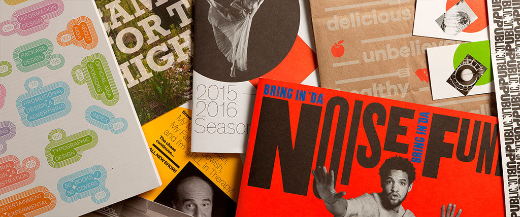
Designing design magazines: Talk & panel discussion at St. Bride
On February 16th we celebrated the publication of Impact 1.0 and Impact 2.0, with a talk and panel discussion at St. Bride.Here are some of the insights unearthed during Adrian Shaughnessy’s chat with Teal Triggs (RCA), Richard Spencer Powell (Monocle), Solveig Suess (Concrete Flux), Jeremy Leslie (MagCulture) and Tony Brook (Spin/Unit Editions). ‘Digital is catchy, but it goes in one eye and out the other.’Jeremy Leslie‘I know Brexit is bad. Trump is bad. But, the Economist’s sales are up. People want to read news in longform.’ Richard Spencer Powell‘Many magazines might be struggling. But, there are hundreds of stimulating, niche magazines - about things you’ve never known you were interested in.’ Tony Brook‘Aesthetic journalism is visual culture as an investigative means.’Solveig...
Have you watched Paula Scher on Netflix’s Abstract: The Art of Design?
‘I’m allowing my subconscious to take over, so that I can free associate. You have to be in a state of play to design. If you’re not in a state of play, you can’t make anything’ Paula ScherHaving spent the past year and a half making the definitive Paula Scher monograph - Paula Scher: Works - we were eager to watch the sixth episode of the new Netflix series Abstract: The Art of Design. Produced by Morgan Neville (20 Feet from Stardom) alongside Scott Dadich (Wired’s departing editor-in-chief), the Paula Scher episode weaves together the experience of navigating the industry, the dangers of bad design (the Palm Beach ballot that threw the 2001 USA presidential election), the mapping of questionable...
Richard Hollis on FHK Henrion
Interview by Adrian Shaughnessy
What was Henrion’s contribution to British design?He was important in trying to get acknowledgement of graphic design as a profession through his work with the SIA (Society of Industrial Designers). He was very involved with education, and sat usefully on several boards, especially AGI, where he had an important role, partly because of his skill with languages, and partly through his editing and designing of the compendium (AGI Annals). He was a very generous man, especially to young designers. How would you evaluate Henrion as a designer? His design was variable in quality, although a few works were outstanding. The ‘Aid the Russian Wounded' was a striking poster. I have reservations about the CND poster – it was ridiculously derivative...
Paula Scher: Works
‘Paula Scher is the most influential woman graphic designer on the planet’ Ellen Lupton, Abstract: The Art of Design, Netflix Update: We are excited to announce our latest edition, Paula Scher: Works (concise edition) [Unit 37], available for pre-order now.This definitive, chronological visual record spans Paula’s early days in the music industry as an art director with CBS and Atlantic records; the launch of her first studio, Koppel & Scher; and her 25-year engagement with Pentagram. The monograph is also a visual record of contemporary New York’s urban fabric, indelibly transformed by the designer’s innovative approach to environmental graphics and identity design: from MoMA to Charter Schools; from the High Line to Shake Shack. Her logos for global corporations and cultural institutions have...