Manuals 2 case study: Reuters
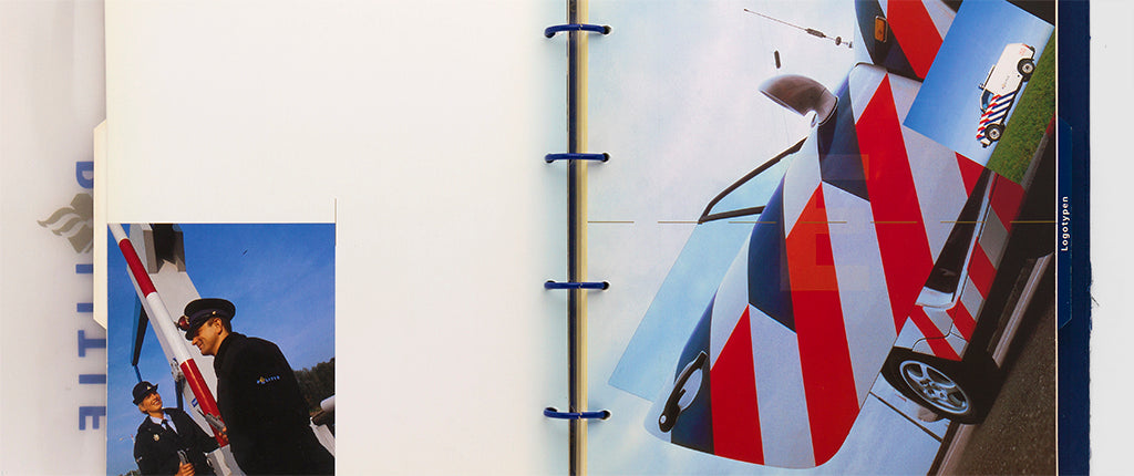
Alan Fletcher’s 1965 identity system for Reuters is featured in our book, Manuals 2: Design & Identity Guidelines. It is presented here as our first case study that examines some of the outstanding projects in the book, to coincide with our Kickstarter campaign to republish it, which is live now. With your help we can bring this important title back into print!In 1965, with the formation of the Pentagram studio still seven years away, Alan Fletcher was part of Crosby/Fletcher/Forbes, the new design group formed after Bob Gill had departed Fletcher/Forbes/Gill that same year. The international news agency Reuters presented the team with a multidisciplinary project to overhaul the company’s identity. Fletcher’s ‘dot-matrix’ design idea was born out of the holes punched out of the ‘teleprinter’ tape which was used in...

Manuals 2 – interview with Liza Enebeis
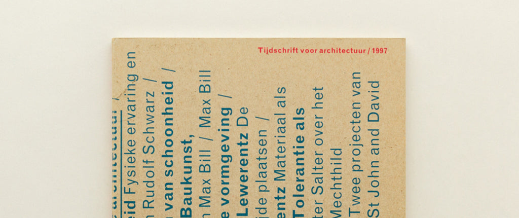
The following is an edited version of the interview between Studio Dumbar’s Liza Enebeis and Adrian Shaughnessy that appears in Manuals 2: Design & Identity Guidelines. Our Kickstarter campaign to republish Manuals 2 is live now! With your help we can bring this important book back into print. Liza Enebeis has been at Studio Dumbar since 2008 and is now a partner and Creative Director. After graduating from the Parsons School of Design in New York and the Royal College of Art she began her career at Pentagram in London, remaining there for several years. In 2003 she relocated to the Netherlands. Enebeis also co-founded the typography and design podcast channel, Typeradio, and regularly posts work to Instagram via Books Love Liza. The images shown here...

Book of the Month: Impact – interview with Teal Triggs
Over the last few weeks we’ve been posting to Instagram some of the great cover designs that feature in Impact 1.0: Design magazines, journals and periodicals [1922–73] and its sister volume Impact 2.0 [1974–2016]. As our Book of the Month, we’re happy to share Adrian Shaughnessy’s interview with academic and writer Teal Triggs, which appears in volume 1.0. Here, Teal discusses the differences between UK and US design magazines, the impact of online on design journalism and how the design press has represented the work of female designers. Adrian Shaughnessy: What was the first design publication that caught your eye? Teal Triggs: It would have been Domus (1928–present, Italy) in the late 1960s when I couldn’t have been more than ten years old. My...

Unit/10 top ten – Krautrock!
Our latest Top Ten post in celebration of our decade in publishing turns to music, specifically the cosmic sounds of Krautrock. As a lifelong fan of the genre, Adrian Shaughnessy picks ten of his favourite records – from releases by Can and NEU!, to Harmonia and Cluster. If you are a fan of John Lydon, The Fall, Julian Cope, Boards of Canada, Stereolab or Berlin-era Bowie, you’ll already be a fan of Krautrock. I prefer the name Cosmische Musik, but I’m talking about the school of music that flourished in Germany in the late 1960s and early 1970s. It was music made with guitars, drums and keyboards, but it wasn’t pop music. It was much closer to the 20th-century classical avant...

Unit/10 book list – Matt Pyke, Universal Everything
As part of our Unit/10 anniversary celebrations, we’re running a series of book lists here on the site. For our second list we asked Matt Pyke, founder of art and design studio Universal Everything, to pick a selection of his favourite books that have helped shape his life and work. The ground-breaking projects that Pyke and his various collaborators have created over 15 years is the subject of our forthcoming book, What is Universal Everything?, more details of which will be revealed very soon. For now, enjoy Matt’s own list of inspirational and thought-provoking books. The Object Stares Back – On the Nature of Seeing by James Elkins The book which taught me the fundamentals of seeing, our primal perception of movement...

Unit/10 book list – Mark Sinclair, Unit Editions
For our first Unit/10 book list – collections of favourite books on visual culture as selected by the Unit team, our friends and collaborators – Unit’s senior editor Mark Sinclair shares some highlights from his bookshelves. As well as we think we know them, favourite books are always ready to give up their secrets again, from long-forgotten sentences, thoughts and ideas, to sequences of images or design decisions we previously might have missed. Some of the books I’ve chosen here are ones I’ve not opened for a while, but, in going back to them over the past few days, I’ve both recognised – and been surprised by – what they contain. Peter Mendelsund had already established himself as one of the world’s most talented book cover...

Talking with Rhoda Lubalin
By Adrian ShaughnessyOne of the great pleasures of researching our book on Herb Lubalin was speaking to his widow, Rhoda. An artist in her own right, Rhoda Sparber provided me with a unique insight into her life and work, and her time with her late husband. Rhoda was Herb’s second wife. His first, Sylvia Kushner, died in 1971. Some of Rhoda’s work can be seen in an issue of UL&C magazine, where she made sculpted heads of Saul Bass, Lou Dorfsman and Milton Glaser. Her life in art began in ninth grade. Rhoda Sparber, 1971As she told me: “My art teacher Ms. Curran, (carrot-colored hair, purple clothes) tiptoed to my desk and whispered ‘Mayor La Guardia is opening a new...

Ten Things You Should Know About Herb Lubalin
Our recent Kickstarter campaign to republish our 2012 book on US designer and typographer Herb Lubalin was successful. Warm thanks to all our backers! Last year, Adrian Shaughnessy talked to the #Lubalin100 project about his experience of writing and researching the book, and describing what he discovered about this legendary figure of American graphic design. By way of an introduction to Lubalin we present the full text, here. Prior to writing a book on Herb Lubalin (1918–81), I had a rather sketchy opinion of him, writes Shaughnessy. Of course, I recognised that he was a significant American typographer and designer, responsible for some high quality typographic logos and a handful of era-defining typefaces. Yet the more I delved into the life and work of Lubalin,...

Unit Editions @ ten
By Adrian Shaughnessy When we started Unit Editions ten years ago, lots of people told us not to waste our time. Print was dead, they said, and it certainly looked that way. Bookshops were closing, magazine and newspaper sales were evaporating, eBooks were on the rise, and pretty much everything that was once printed now seemed destined to move online. But something told us this wasn’t the complete picture. When Tony Brook and I decided to set up a publishing company, we were only sure of two things: firstly, we both loved books and, secondly, we knew that graphic designers, no matter how immersed in the digital world, also loved books. So, despite the warnings about the future of print, we pushed ahead and formed Unit Editions. Now, ten...

Season’s Greetings, Herb Lubalin style
By Mark Sinclair The festive season provided Herb Lubalin’s New York studio with an opportunity to send warm messages of goodwill to its clients, while indulging in some witty, often heartfelt, self-promotional work that displayed its mastery of type. To coincide with the republication of our 2012 monograph, Herb Lubalin: American Graphic Designer 1918—81, we wanted to take a look at some of the work his studio made around this time of year, some forty-five years ago. The festive messaging that Lubalin and his team produced in the early 1970s – from Christmas and New Year’s cards, to packaging designs for client gifts – occupies an interesting place within the studio’s creative output. Take this holiday poster from 1967, issued by the Lubalin studio’s second incarnation where long-time associate...
