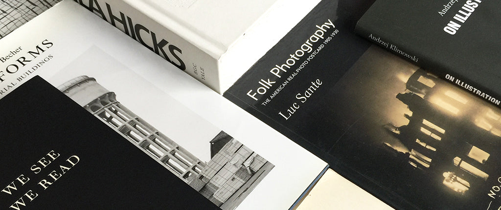
For our first Unit/10 book list – collections of favourite books on visual culture as selected by the Unit team, our friends and collaborators – Unit’s senior editor Mark Sinclair shares some highlights from his bookshelves.
As well as we think we know them, favourite books are always ready to give up their secrets again, from long-forgotten sentences, thoughts and ideas, to sequences of images or design decisions we previously might have missed.
Some of the books I’ve chosen here are ones I’ve not opened for a while, but, in going back to them over the past few days, I’ve both recognised – and been surprised by – what they contain.
Peter Mendelsund had already established himself as one of the world’s most talented book cover designers when he published What We See When We Read (Vintage), a fascinating, often playful visual essay about how we read and interpret literary texts.
As a designer, he brings an interesting perspective to the enjoyment of reading and the mechanics of visual construction. A very revealing and rewarding book.
A great writer can bring any subject alive and Luc Sante does just that in his book, Folk Photography: The American Real-Photo Postcard 1905-1930 (Yeti), a brilliant study of the way technology enabled the sending of images of local, newsworthy events via the US postal service at the beginning of the 20th-century.
The postcards themselves are bizarre and fascinating, while Sante’s writing is a joy.
On the subject of joy, how about the drawn adventures of a cat called Krazy and a mouse named Ignatz? George Herriman’s surreal comic strips from the 1930s and 40s were a real discovery for me – and the influence of them on modern cartooning is considerable.
The Fantagraphics edition I have collects the later Krazy Kat strips from 1941-2, reminding me I still need to look further into Herriman’s work, which goes back to 1913.
The action hangs on Krazy’s unrequited love for Ignatz – and the latter’s attempts to curtail the cat’s advances by throwing bricks at his/her head (which Krazy takes as a sign of love). Confusing, witty, brilliant and nearly 100 years old.
I really like the format of this book from Penguin; essentially the transcripts of several conversations between the curator Hans Ulrich Obrist and Chinese artist Ai Weiwei.
The Q&A format can often be the clearest way to render an interview (the reader sees the question asked, rather than just the answer as a quote) and, here, the sense is that you are sitting in an audience listening to one of today’s most significant voices in art talking about his life and craft.
As an example of the book as an artwork in its own right, Irma Boom’s design for textile artist Sheila Hicks’ Weaving as Metaphor (Yale), takes some beating.
From its tactile deckle edges to the varying type sizes and detailed reproductions of Hicks’ intricate works, the book honours the artist’s sensibilities perfectly. In the hand it echoes the feel of both paper and cloth – a big, white block of fibres containing all manner of colourful works within.
A book of the cool, detached photographs of mainly European industrial buildings by Bernd and Hilla Becher offers a nice counterpoint to Hicks’ art. The pair’s images of these striking structures, such as blast furnaces and water towers, have long been celebrated; the lines and forms appealing to the designer as much as the photographer.
This Thames & Hudson collection of work made across their career records an architectural landscape that has gradually disappeared, while highlighting their contributing to modern photography – and its potential subjects.
Andrzej Klimowski’s On Illustration (Oberon Masters) is a neat evocation of what’s involved in a pursuing a career in the art form, recalled from personal experience. Klimowski touches on everything from the immediacy of drawing and the importance of reading, to the illustrator’s identity and working with clients.
At just over 60 pages, it’s a slim book, but one packed with detail from a long life in illustration alongside some wonderful anecdotes.
Finally, a fairly tatty edition of a familiar yet influential book. And it’s only now, years after first reading – and writing – about John Berger’s Ways of Seeing (Pelican), that I’ve noticed the unusual credit given to the book’s designer Richard Hollis.
The second page of my 1982 paperback edition includes the line “A book made by…” and introduces the five people who contributed to the book’s construction, including Berger, Hollis and Michael Dibb, the director of the ground-breaking 1973 BBC TV series upon which the book was based.
It’s rarely stated that books are actually ‘made by’ people in this way – and I rather like its collaborative inference.
Hollis’ intelligent design and layout centred on the relationship between text (set in ‘Monophoto’ Univers) and related image, and still looks fresh today, 45 years after it was first published.
In his introduction, Berger even asserts the role the design plays in disseminating his message: “The form of the book is as much to do with our purpose as the arguments contained within in it.”
It’s a good way to think about the book in general – an inseparable combination of content and form, brought together in collaboration.
Unit/10 is our celebration of ten years of Unit Editions. Look out for more book lists and details of other projects in the coming weeks.


