Alan Fletcher’s 1965 identity system for Reuters is featured in our book, Manuals 2: Design & Identity Guidelines. It is presented here as our first case study that examines some of the outstanding projects in the book, to coincide with our Kickstarter campaign to republish it, which is live now. With your help we can bring this important title back into print!
In 1965, with the formation of the Pentagram studio still seven years away, Alan Fletcher was part of Crosby/Fletcher/Forbes, the new design group formed after Bob Gill had departed Fletcher/Forbes/Gill that same year.

The international news agency Reuters presented the team with a multidisciplinary project to overhaul the company’s identity. Fletcher’s ‘dot-matrix’ design idea was born out of the holes punched out of the ‘teleprinter’ tape which was used in newsrooms at the time – not, as is often thought, the ‘tickertape’ used for stock market information, according to Reuters’ then General Manager, Michael Nelson.

This identity system was based on a “regular modular pattern” and the logotype was constructed from 84 dots. This gave the design some creative flexibility in terms of how the Reuters name could be reproduced, with “holes, lightbulbs, nuts and bolts, coins, bottle tops” all apparently used to render the name at some point, according to project page on the Alan Fletcher Foundation site.

In the introduction to the design manual that accompanied the new identity, the following text introduced the visual components: “Reuters has adopted a house style – a carefully designed form of presentation for all printed matter. We have done this because just as Reuters itself is modern and efficient so should the face be that it presents to its subscribers and the public.”

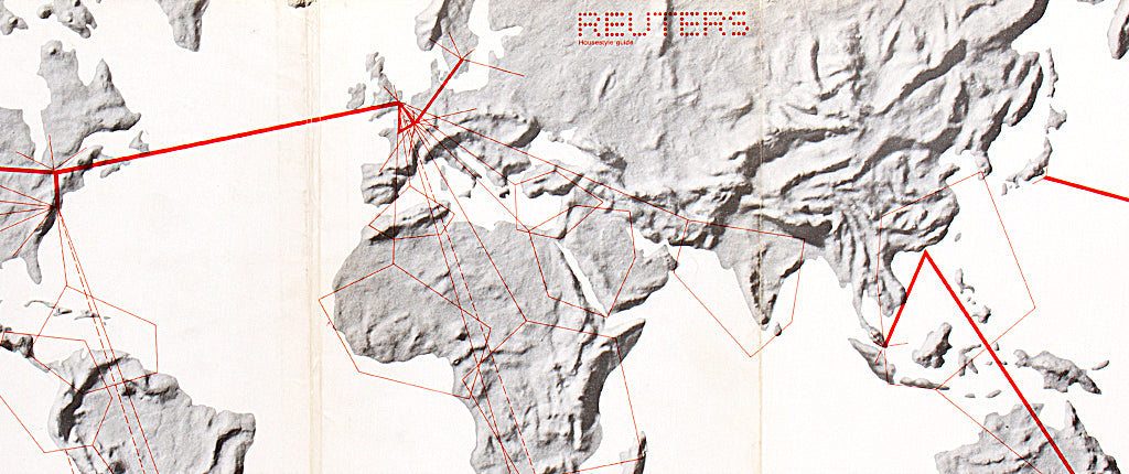
Typefaces chosen for the stationery were Neue Haas Grotesk Light and Helvetica Light, while the manual itself made use of a foldout, wrap-around cover (below) and different paper stocks, including tissue papers.

Fletcher’s identity was in use for just over 30 years, until the dots were transferred to a roundel design and a new logotype was introduced in the late 1990s. The organisation became Thomson Reuters in 2008.
The design manuals for Reuters (1965) is one of 20 featured in our book, Manuals 2. With your help we can republish the title – visit our Kickstarter to find out more about the publication and to see the rewards available.