The Japanese magazine Idea is one of the most important and long-lived graphic design publications in the world. It began publishing in 1953, and since then it has consistently occupied a position at the forefront of the international graphic design scene. Initially the magazine functioned as a shop window for designers around the world: to be ‘showcased’ in Idea was to be acknowledged as a significant figure in world design. In more recent years, and now under the editorship of Kiyonori Muroga, the magazine has developed a more critical position. It is widely seen as having a sharp eye for significant and game changing developments in international graphic design. For designers in the West, to be featured in Idea is a badge of achievement to be worn with pride.
Idea has always made high-grade reproduction and state-of-the-art printing as two of its defining qualities. This is coupled with striking covers and a dynamic non-formatted layout. Traditionally, Idea front covers were designed by the main designer featured in each issue. Today, covers are a mix of original specially created artwork, or elements taken from featured articles.
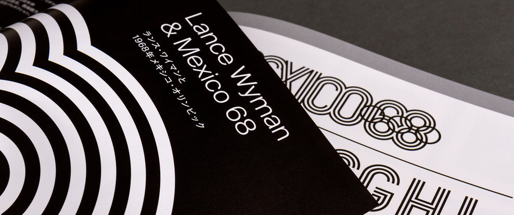
For the most recent issue (Idea No.374) Kiyonori Muroga commissioned Unit Editions to write and design a 24pp feature on the Mexico 68 Olympics work of Lance Wyman.
Here are a few spreads from the feature.


