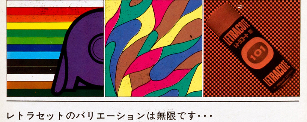
Our book Letraset: The DIY Typography Revolution contains a wide range of material relating to the innovative rubdown lettering system, not least a good selection of the thousands of type sheets and catalogues that the company produced.

The book also includes a few examples of the advertising and promotional literature that Letraset also made to sell its product, most of which are intriguing examples of print design in their own right.
So, here, we feature some of the ads that were created specifically for the Japanese market in the 1970s.

In general, Letraset advertising was usually designed to show the versatility and range of the lettering sheets and mostly appeared in various international design publications. In Japan that would have included both Graphic Design and IDEA.

Print ads were also produced to show Letraset’s non-typographic products such as Letraline tapes, Letrasign, various aerosol products, protective vinyl folders, clip art sheets, textured film and customised logo sheets.

The ads themselves rarely followed a standardised design and, aside from the inclusion of the Letaset logotype, it appears that their designers were largely free to design them how they liked for their particular market.

The result was a wide variety of approaches, often reflective of national characteristics and design styles, and a vibrant body of communications that outshone most of the promotional literature produced by typesetting houses at the time.

A ’76 New Fashion spread, for example, shows 30 Letraset typefaces and three sheets of patterns (detail shown), while another (above) employs a (photo)graphic composition of tools across the page.

Letraset: The DIY Typography Revolution is available to purchase from the Unit Editions shop, here.

